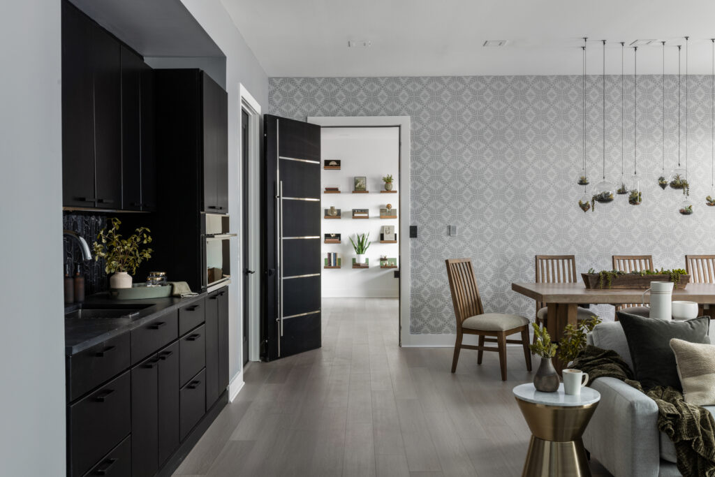
Modern design is all about clean lines, minimalism, and functionality. But that doesn’t mean you have to sacrifice visual interest. With the right wall treatments, you can add texture, color, and depth to your space. Here are six wall treatments we used at Pinhoti Peak to add visual interest to our modern space:
1. Tile
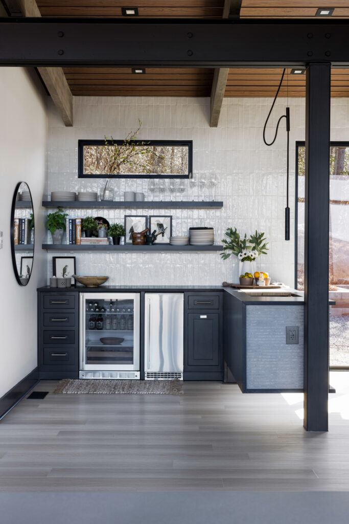
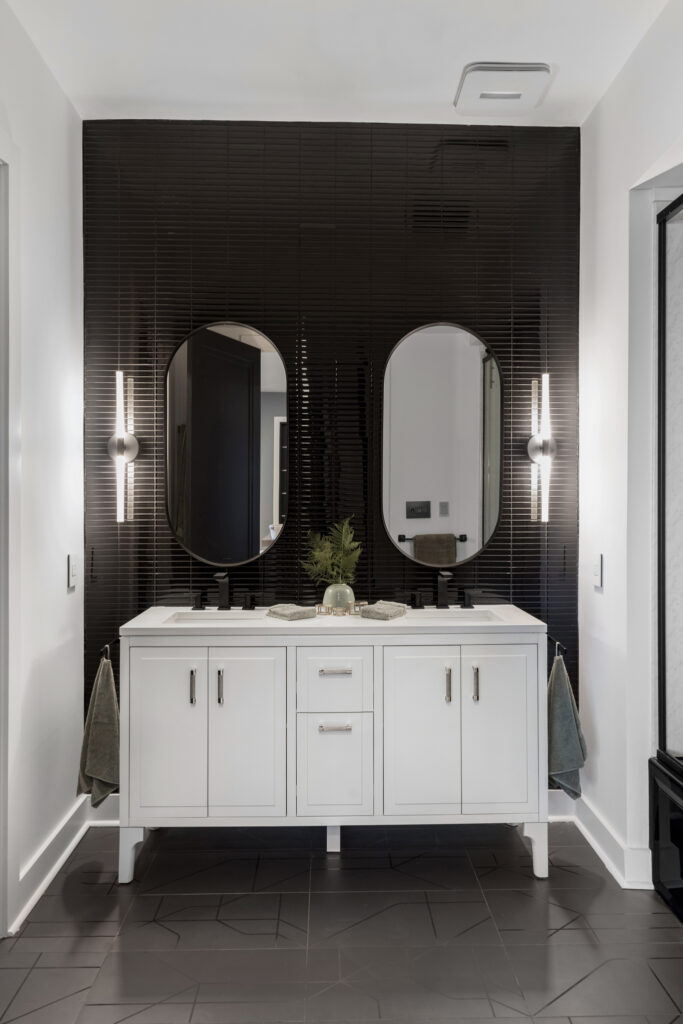
A monochromatic tile installed on a whole wall can create a striking and visually interesting element in modern design. By using tiles of the same color or shade, the wall becomes a unified canvas that allows other design elements to take center stage. This creates a clean, minimalist look. Whether using white, cream, or gray, a light-neutral monochromatic tile wall can add texture and depth to a room while maintaining a cohesive and sophisticated feel. In contrast, a black tile wall can create a more dramatic effect, with the darkness of the tiles adding an edgy and bold element to the space. While both white and black tile walls can work well in modern design, they offer very different visual impacts and can be used to create unique and distinctive looks as you can see in our Fort Mountain Kitchen and in our Tatum Lead Bath.
2. Wallpaper
Yep…that’s right! Wallpaper is making a come back!!! With a wide range of modern wallpaper selections, York Wallcoverings helps you add color and pattern to your space. From bold geometrics to subtle textures, there’s a wallpaper to suit every style. Plus, many of their wallpapers are peel-and-stick or pre-pasted, making them easy to install and remove.
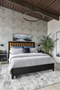
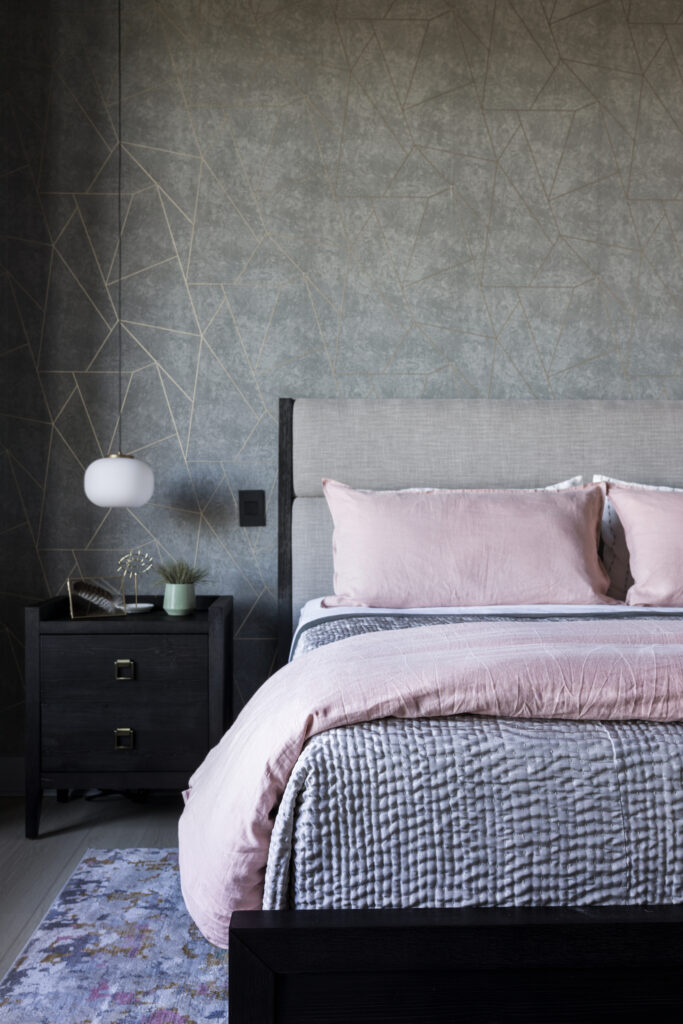
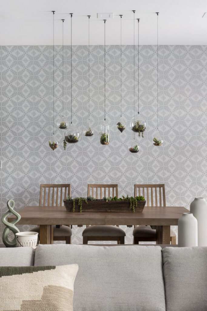
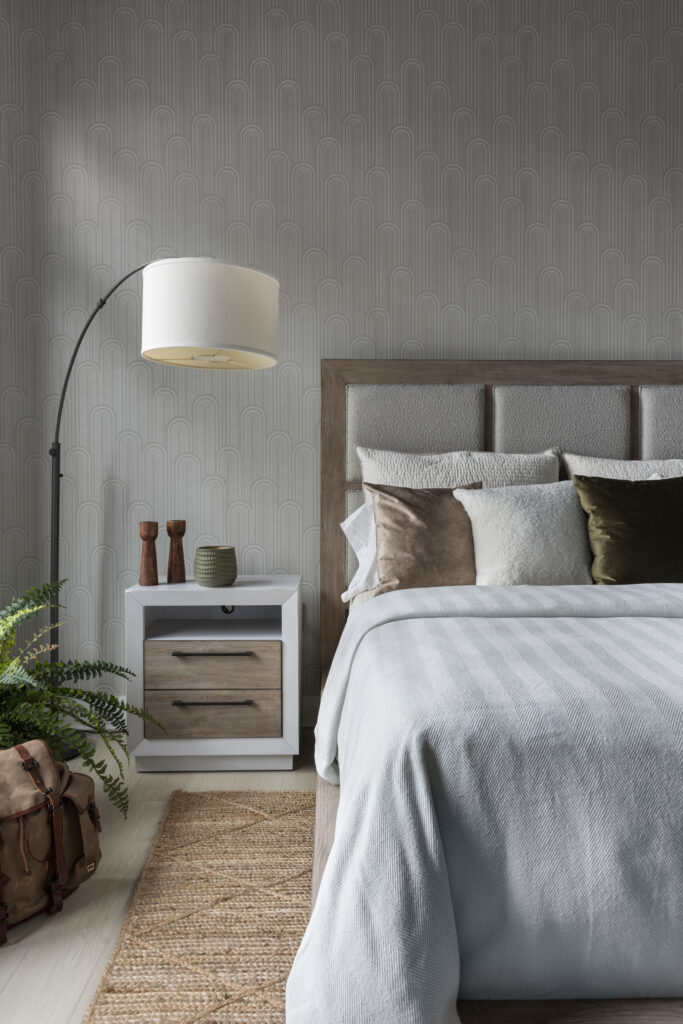
The Nazca wallpaper in the Brasstown Bedroom features an abstract geometric pattern in a warm, earthy color palette, which adds a touch of texture and depth to our bedroom. Speakeasy is a rounded geographic graphic pattern that brings a chic and sophisticated feel to our Cohutta Overlook Bedroom. The Dreamchaser mural gives a bold greeting in our entryway. We loved the organic, tribal-inspired patterns in muted tone of the Tribe Wallpaper install in the Benton MacKaye bedroom so much we added a second install to the Catoosa Valley dining room. The stunning, marble-like design of the Onyx Strata adds a luxurious and modern touch to our Blue Ridge suite. All these wallpapers work well with modern design, as they offer a range of textures, patterns, and color palettes that can be paired with other modern design elements to create a cohesive and stylish look.
3. Wood-Grain Printed PVC Boards
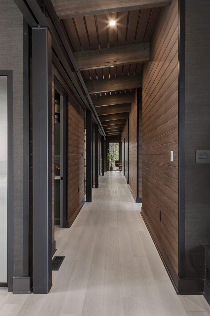
These boards from Versatex have the look of natural wood, but with the durability and low maintenance of PVC. Their canvas series comes in a range of colors and patterns, plus they can be used for walls, ceilings, and even outdoor applications! We opted for the Turner Oak finish that has a warm, textured wood-grain design that truly does look just like real wood. The dark wood walls paired with our lighter colored floors create a striking contrast down the hallway at Pinhoti. I can’t imagine any combination that would look better or be easier to maintain.
4. Custom Wall Panels
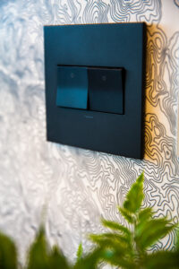
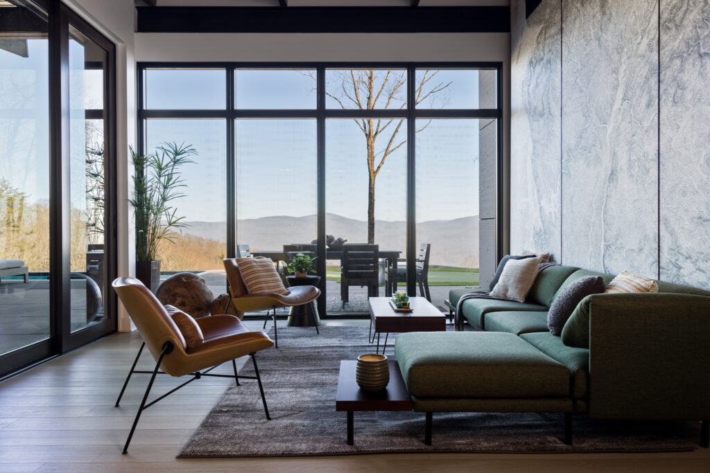
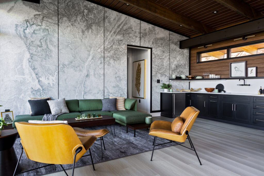
We teamed up with Muir Way and Wilsonart to create a show stopping installation in the ADU. Muir Way’s cartographers helped up with the digitial artwork which is a high resolution topo map of the Pinhoti Trail and and it’s connection into the Appalachain Trail. It’s the most sophisticated “YOU ARE HERE” map I’ve ever seen! The panels are available in a range of materials including high-pressure laminate or veneer, and they can be cut to any size and shape which is critical for a custom install. We couldn’t be happier with how this turned out!
5. The right color paint!
When picking a paint color for modern design, it is important to consider the color’s undertones, as well as its contrast with other elements in the room. Neutral colors like white, gray, and beige are popular choices for modern design, but bold pops of color can also be used to add interest and personality. Ultimately, the goal is to create a cohesive and harmonious color palette that complements the clean lines and sleek surfaces of modern design.
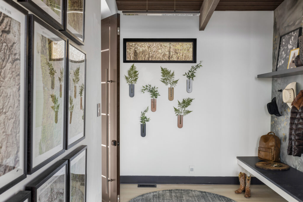
On most walls at Pinhoti we stuck with Benjamin Moore’s “Simply White“. Its neutral undertones and ability to reflect light that floods through all the large windows portrays a bright, yet warm and grounded feel we wanted to capture.
….but we also went BOLD in a few spaces!
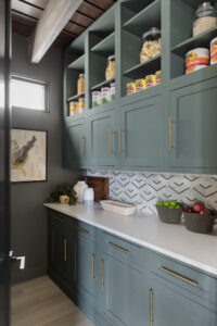
The pantry walls, trim and cabinets are all painted in various sheens “Rainy Afternoon” from Benjamin Moore. This earthy deep green anchored with hints of gray pairs well with natural materials like wood and stone making it a perfect match for our Daltile OneQuartz countertops. And of course those vibrant brushed modern brass pulls from Kohler add the perfect pop without being to showy.
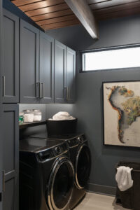
We wanted somthing that was muted, earthy, subtle yet reflective for the laundry. We actually ended up loving “Mineral Alloy” from Benjamin Moore so much in the laundry room that we decided to bring it into the Beasley Knob Bedroom too! This versatile and sophisticated color works well in a variety of modern design styles, from minimalistic to industrial, and can be paired with a variety of materials and textures to create a unique and timeless look.
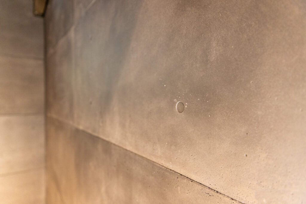
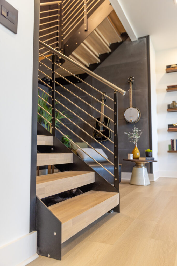
6. Concrete Wall Panels
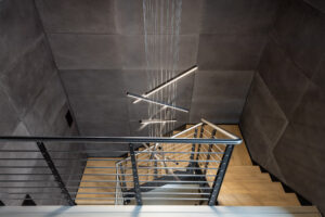
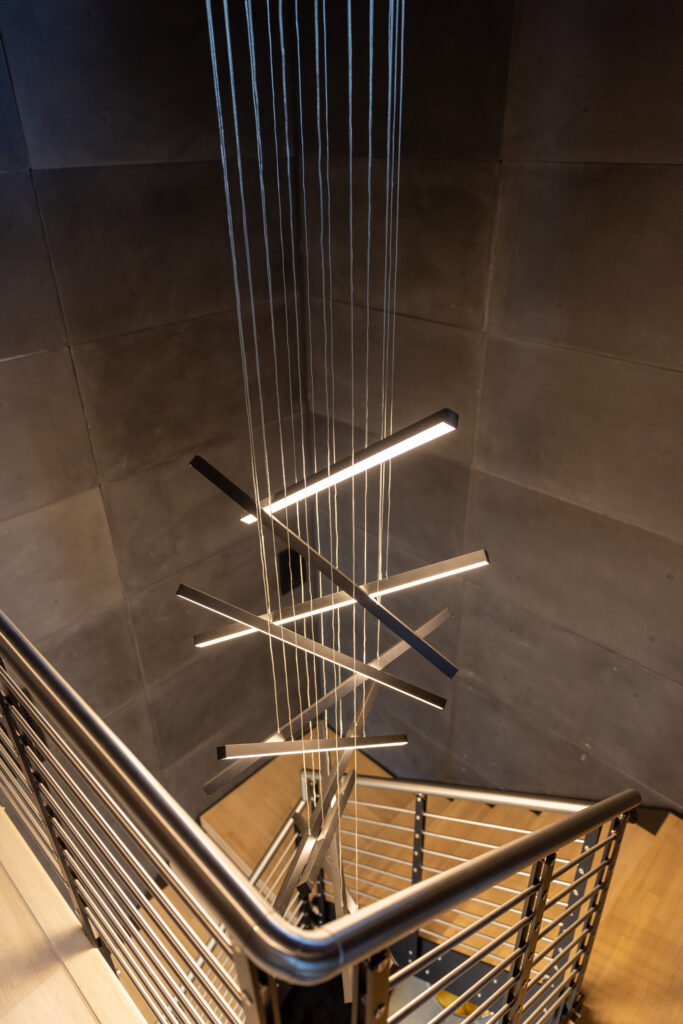
These panels from Wall Theory are made from actual concrete, which gives them a realistic texture and a natural color variation. The panels are lightweight and easy to install. At Pinhoti, we used them to cover the stairwell leading into the media room. It’s amazing how a sleek, minimalist look can add an edgy touch to a space and these panels offer a unique and verstaile way to incorporate concrete into modern design without feeling too cold!
We hope you’ve found some inspiration to add visual interest to a modern space!